

 |
12/11/12
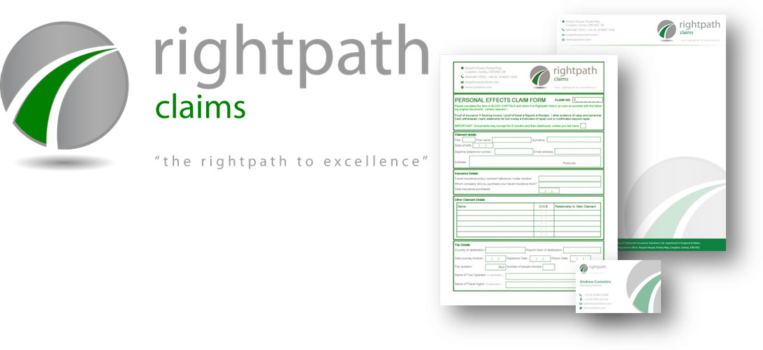
Rightpath Claims Rebrand |
To commemorate 5 successful years in business we commissioned a rebrand and are excited and happy to introduce the revised Rightpath Claims logo. We did not want to move far from the simple fonts of our existing logo, but wanted to introduce a new abstract symbol to support the overall Rightpath brand, and by use of colour, allow easy distinction between the various divisions.
As a technology led business, there was the temptation for adopting a fun, web 2.0 based design but we recognised that as a service organisation we needed to have stronger emphasis on keywords such as trust, professionalism and security which are more suited to a relatively conservative design. Likewise, we do not want a brand that competes with the most important brand of all…the client’s.
We hope you like it.
| Success Stories | Careers Centre |


 + 44 (0) 020 8667 8989
enquiries@rpisolutions.com
Rightpath Insurance Solutions Ltd, New Century House, 17-21 New Century Road, Laindon, SS15 6AG
+ 44 (0) 020 8667 8989
enquiries@rpisolutions.com
Rightpath Insurance Solutions Ltd, New Century House, 17-21 New Century Road, Laindon, SS15 6AG